Donna Addison-Scott differentiates herself in the crowded Broward, Florida real estate market with her focus on authentic relationships and a deep title expertise, delivering unmatched trust and knowledge through the complex real estate journey.
Challenge
In a market saturated with transaction-focused professionals, Donna faced the challenge of differentiating herself and communicating her unique value proposition effectively. The goals were to establish a brand that resonates with her target audience's desire for trust, expertise, and genuine connection, and to leverage her unique background to attract and retain clients.
Approach
In developing Donna Addison-Scott's brand strategy, we centered our approach on defining her mission and core values to guide clients to their homes with unwavering trust and unparalleled expertise, underscoring her dedication to fostering authentic relationships, leveraging her profound knowledge, and prioritizing family-centric values.
We positioned Donna beyond a typical Realtor®—as a compassionate partner blending expertise with genuine care, ensuring clients feel at home even before the search begins. Targeting 35-65 year-olds in Broward, Florida, who value trust, family, and community, we introduced the "Guiding Grace" persona, a warm, knowledgeable, dependable, and sincere representation of Donna, conveyed with an authentic, empathetic, and welcoming tone.
Outcome
A holistic branding and content strategy to boost Donna's market presence and support her in achieving heightened brand recognition through a unified identity and digital footprint that will eventually strengthen her community ties in Broward, Florida, elevating her reputation beyond mere transactions.


"Before starting any project, our clients are guided through our interactive brand discovery survey. The valuable insights gained from this survey combined with our internal research on the market, competitors, and target audience, form the backbone of our design decisions."
- Krystle Karee, Founder
Think Magik
.png)

Redefining Donna's Brand Identity.
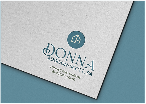
We focused on emphasizing her unique value proposition and deep-rooted expertise. A new logo, color scheme, and typography were developed to convey trust, warmth, and professionalism.
Color Palette
Our choice of earthy tones for Donna's color palette reflects a blend of reliability and warmth, carefully selected to enhance her brand's welcoming and trustworthy appeal.
Typography
Donna's typography, strategically balances classic elegance with modern simplicity. This combination not only underscores her brand's reliability and warmth but also enhances readability and approachability, catering to both traditional and contemporary aesthetic preferences.


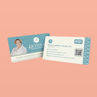
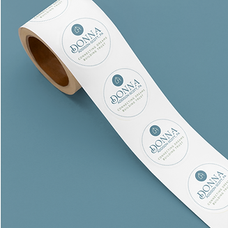
To strengthen brand recognition and extend warmth and personalized experience we integrate stationery and print assets, including business cards, letterheads, thank you cards, stickers, and holiday cards.
Brand consistency across all physical touch points.
Making every interaction with Donna's brand memorable and engaging.

Our Strategy for digital assets focused on establishing a unified presence across online platforms, highlighted by a custom Linktree, social media covers, and templates that mirror Donna's brand persona.

Using deliberate designs to enhance Donna's digital footprint.
By consistently implementing her visual identity and communicating brand essence and values, overtime, there will be a boost in engagement and recognition across all relevant platforms.


.png)
Strategic Branding
The transformation of Donna's brand perception to support her in fostering genuine connections in a competitive industry.

Memorable Visual Identity
The cohesive brand identity helped Donna stand out among her peers and paved the way for meaningful interactions and community engagement.

Improved Online Presence
Consistent implementation will reinforce Donna's brand commitment to genuine connections and expertise.


